ProXFlex
Client: Courtney Pigram & Oliver McGlade (ProXFlex)
What happens when 2 professional basketball players start a training business? You create branding for it.
Movement, momentum, and moxie define ProXFlex.
Client: Popeyes Louisiana Kitchen
Agency: 500 Degrees
CCO: Michael Piekarski
Creative Director: Luis Ferrero
Associate Creative Director: Emily Murray
Art Director: Rachel Winner
Copywriter: Thomas Barry
Popeyes is known for 12-hour marinated chicken. But when it came to branding, they hadn’t cooked up anything new in years. Although the brand’s heritage had built a passionately devoted following, they weren’t winning new, younger customers. The solution was an updated visual identity that cleverly infused new elements into their tried-and-true branding. This included new fonts; “Chicken Sans” and "Chicken Script", a new iconic character named Poppy, and original illustrations paying homage to the brand’s Louisiana roots. It was up to us to help this bird fly the coop and meet the world through our path-to-purchase expertise.
Client: Burger King
Agency: 500 Degrees
CCO: Michael Piekarski
Creative Director: Luis Ferrero
Associate Creative Director: Andrea Zadro
Senior Art Director: Rachel Winner
For more than 20 years, it was business as usual at Burger King. That all changed in 2020. The King needed an updated look from head to toe that represented its legacy but also introduced a new emphasis on quality. Everything from the brand’s logo to merchandising, restaurant décor and menus got the royal treatment, leveraging vibrantly bold colors, a new “Flame” font, updated uniforms and revamped packaging. Rolling out the rebrand at every touchpoint was a massive undertaking that ultimately delivered on the brand’s promise of a vastly improved guest experience.
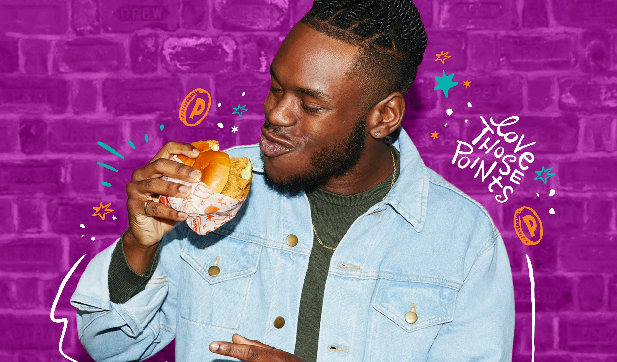
Client: Popeyes Louisiana Kitchen
Agency: 500 Degrees
CCO: Michael Piekarski
Creative Director: Luis Ferrero
Associate Creative Director: Emily Murray
Art Director: Rachel Winner
Copywriter: Thomas Barry
SITUATION
Popeyes had successfully launched a new visual identity and soon after, started to cook up something else in their kitchen: A rewards program. Popeyes looked to us to develop messaging and visual strategy that not only leaned into the new Popeyes branding but also communicated clearly in digital, OOH, and on-premise touch points that the rewards program is only available via the the app or online, making collecting points a digital experience only. Our challenge was to introduce, educate and to say to on-premise guests “Hey, we have a rewards program! Oh, and that food you’re about to order, won’t get you points because it wasn’t ordered online or through our app:).” but in a nicer, more congenial way.
STRATEGY
When considering guest mindsets and each phase of the path-to-purchase (digital and on-premise), we paired concise, punchy copy with graphics exuding joie de vivre to position Popeyes Rewards as something that is so good that it is exclusive to the app. We determined that attraction-like merchandising should introduce the program, those aimed at influencing the order plan should drive app download, transaction-centric collateral should eliminate any guesswork, and those meant to engage guests should drive app/online ordering and the collection of points.
Client: Sajacks Transport
Art Director: Rachel Winner
SITUATION
Sajacks Transport, a family-owned logistics and transportation company, is known for providing safe and superior transportation solutions to both small and large companies. Sajacks Transport came to me for help in creating a look for them to stand out in the fast-paced, competitive transportation industry.
STRATEGY
After speaking with the owners and executive leadership, I designed and developed a new identity that referenced Sajacks Transport’s confidence in providing smart and personable service to their clients. The resulting logo combined forward motion with a signature to bring to life both their family-owned heritage and their goal of always providing forward-thinking solutions.
Client: National Veterans Memorial and Museum
Agency: Fahlgren Mortine
Executive Creative Director: Mark Westman & Andy Knight
Creative Director: Bill Marconi
Art Director: Rachel Winner
Video Production: Mills James Inc.
SITUATION
The National Veterans Museum and Memorial, named one of Architectural Digests most anticipated buildings of 2018, needed a meaningful and enduring brand established, while driving ticket sales and membership inquiries.
STRATEGY
Keep the focus on people. This is not a war museum. You will not see tanks or fighter jets on display here. What you will see is courage – reflected in the stories, experiences and personal effects of America’s Veterans. Which is why we say…It’s More than a Museum. It’s the New Home of the Brave.
Through a multi-channel marketing campaign, focused on Central Ohio (May-Dec. 2019), we leveraged this unique trait of the museum and connected visitors to the simple fact that this is a one-of-a-kind museum worth experiencing.
THE RESULTS
4,790,000 digital impressions, 40,300 site sessions, 19,000 event page views, 1,200,000 Pandora impressions, 3,800,000 potential Eason visitors, 146,000 moviegoers, 205,000 paid social impressions with 7,600 clicks and 1,200 attendees driven to events. +15,000 visitors (and counting) from the launch of the campaign
Client: Emerson’s House of Refuge
Art Director: Rachel Winner
SITUATION
As a way to support mission work in Soyapango, San Salvador, Emerson’s House of Refuge missionary and board member, Jason Cox, came up with the idea of combining two of his passions: coffee and mission work. The idea of Dos Manos Misson Coffee was born and now, needed a look.
STRATEGY
Inspired by the Salvadorian flag, tattoo art, and the mission statement of Dos Manos, I developed a label and brand mark that brought to life all aspects of Dos Manos: the name, the mission work, and the place (El Salvador).
Client: Sajacks Transport
Art Director: Rachel Winner
SITUATION
Sajacks Transport, a family-owned logistics and transportation company, is known for providing safe and superior transportation solutions to both small and large companies. Sajacks Transport came to me for help in creating a look for them to stand out in the fast-paced, competitive transportation industry.
STRATEGY
After speaking with the owners and executive leadership, I designed and developed a new identity that referenced Sajacks Transport’s confidence in providing smart and personable service to their clients. The resulting logo combined forward motion with a signature to bring to life both their family-owned heritage and their goal of always providing forward-thinking solutions.
Client: Bed Bath & Beyond
Agency: SBC Advertising
Executive Creative Director: Ben LaPlaca
Art Director: Rachel Winner
Copywriter: Lee Ann Roberts & Emmy Runyon
Designer: Mike Soltis
SITUATION
Bed Bath & Beyond wanted to bring to life what can’t be found in their brick-and-mortar stores and to position themselves as a source of inspiration and a go-to place for home decor.
STRATEGY
We decided to focus the catalogs on the products that make every day life better. The art direction for the book was inspirational, the content conversational, and the moments realistic. We pushed the envelope on gender roles and what a room in a home looks like. A stylish, no-fuss approach to product styling, a mixture of high-end and affordable products and a fresh design approach positioned Bed Bath & Beyond as a home decor expert from season to season.
Client: Ohio Tuition Trust Authority
Agency: Fahlgren Mortine
Partner/Strategy & Creative: Neil Widerschein
Art Director: Rachel Winner
Senior Copywriter: Jen Licón-Conner
Animation Art Director: Cody Philips
3D Artist: Ryan Wyss
Director/Editor: Storytellers Anonymous
SITUATION
Make saving for college a now problem for parents/families – in this case, involving those that have an interest in sports.
STRATEGY
Through a targeted CTV spot to air on Fox Sports Ohio, we explain the advantage of starting an Ohio 529 Plan now in a way that a sport enthusiast will understand.
Client: Bed Bath & Beyond
Agency: SBC Advertising
Executive Creative Director: Ryan Conover
Art Director: Rachel Winner
Copywriter: Emmy Runyon
Designers: Morgan Johnson, Joel Jackson
SITUATION
Bed Bath & Beyond and their internal design team, were in the process of re-branding their circulars (from both a visual and content perspective). They asked us to bring this to life in a few, key circulars.
STRATEGY
Each circular positioned Bed Bath & Beyond as a full-home solution, from season to season and engaged customers through its’ bright, colorful art direction, content that lended itself to “getting the inside scoop,” and value-driven/seasonal relevant product stories.
Client: National Veterans Memorial and Museum
Agency: Fahlgren Mortine
Executive Creative Director: Mark Westman & Andy Knight
Creative Director: Bill Marconi
Art Director: Rachel Winner
Video Art Director/Editor/Production: Cody Philips
SITUATION
The National Veterans Museum and Memorial wanted to let families know that they aren’t some boring history lesson but the perfect place for parents and their kids to visit while they are on spring break.
STRATEGY
Kids look up to heroes, most of which are masked and wearing a cape. And being a kid, well, that can take courage. Our idea used these two, familiar ideas (heroism and courage) and drew a line straight to The National Veterans Memorial and Museum. Our idea tells the story that real heroes do exist and that courage is right around the corner. A targeted media plan allowed us to bring this message to life through video, radio, social ads and web banners.
Client: Ohio Tuition Trust Authority
Agency: Fahlgren Mortine
Partner/Strategy & Creative: Neil Widerschein
Art Director: Rachel Winner
Senior Copywriter: Jen Licón-Conner
Animation Art Director: Cody Philips
3D Art: Ryan Wyss
Director/Editor: Storytellers Anonymous
SITUATION
Overcome the inertia relating to saving for college by making it a NOW problem, with Ohio’s 529 Plan being the simple solution.
STRATEGY
Through a highly targeted media plan (pre-roll, programmatic banners), a custom landing page, and targeted social strategy (Facebook instant experience, video ads, promoted ads), we brought the future issue of college into the present moment, literally. By leveraging key moments, like your kid going back to school or starting to make their own decisions by picking out their own outfit, we were able to educate parents on how simple it is to meet whatever savings goal they may have by taking advantage of the tax-free savings power of a Ohio 529 Plan from CollegeAdvantage.
AWARDS
Platinum Marcom Award